My name is Doug White and I have over 25 years of multi-media experience. I went back to school in 2011 after attending The University of Southern California from 1991-1993, as I wanted to refine my typography and brand skills as a designer. Coming from a film background I worked in Broadcast Television for the past decade and sought to improve the style guides and TV shows I worked on. I enrolled in the Graphic Design program at Full Sail and graduated in 2014. The program was every bit I thought it would be, not because it was like USC, but because I put every effort and square dollar into my training in hopes of refining and improving my tools. In short, you get what you put into the program and that came with 4 Course Directors awards and a new tool belt to make my portfolio shine. Attending the Master of Media Design program has only added icing to the cake. One area I wanted to refine and still have as a main goal is the creative writing process. My previous work lacked writing and the presentation of Design Solutions class has helped open my eyes to synthesizing my findings and mostly, backing them up with substantiating APA style formatted claims. Thank you Professor Ryan McClung for continually creating a sense of urgency prior to graduation on the importance of writing and backing up what you write.
Looking at each project as an investigation has been the greatest take away from the Masters course. (Visocky, O’Grady) “Documenting the functionality and success of a finished project is an important phase in the research cycle and should not be overlooked. Often, these kinds of statistics are the most compelling when making a case for the value of design.”
The Master of Media Design course has also sharpened my skills in Adobe Suite, Adobe Illustrator, Adobe Photoshop, Adobe In Design, Adobe Premiere and After Effects. I took on new learning’s such as advanced typography, advanced color principles, swatches, animation and motion graphics. Story boarding and concept drawing were also a design favorite of mine. I also utilized Maslow’s Hierarchy of needs to design and conceptualize the voice and tone within creative briefs, design briefs and brand guides. Understanding and applying a SWOT Analysis was also a new learned skill that is crucial to brand development and or logo development.
The final production of surveys was designed to better understand the brand awareness behind our campaigns and to lock down the design efficacy of the brand. Most of all I learned how to synthesize and write weekly takeaways that can be used in real world situations. The collaboration between students and professors was an experience that refined my communication and written skills so that I can truly practice and preach being an MFA in my future endeavors.
“Developmental Documentation is essential to record and organize your research clearly. To get the most out of the investigative process, designers should take copious notes, organizing them into categories, and keeping them in a job ticket of some kind.”
(Visocky, O’Grady) A Designer’s Research Manual P.86
START AT FULL SAIL
DESCRIPTION
The amount of training I did at Full Sail University was a big plus when juggling client work. I applied branding principles and animation that took my portfolio to another level. Now that Full Sail is coming to an end and graduation is around the corner, I will focus more on my favorite applications like Adobe After Effects and Cinema 4D. I sometimes wish I would have done the animation program at Full Sail University but I am glad I have a Swiss Army Knife and arsenal of design tools to accomplish most any media job, not just animation. I may just have to sit in on a few animations courses to see how it fits.
Initially I started my Masters Degree in 2016 after I received my Bachelors in Graphic Design in 2014. Unfortunately work got in the way and I dropped from the program. Looking back at this video is a reminder on how far I have come. It’s been five years since I set goals and went back to school during the Covid 19 pandemic to finish what I started. The DLO experience on my Mastery Journey and in this video is to never give up and face adversity with full strength and understanding that you have to finish no matter how hard projects get.
Mostly, I learned from my classmates and instructors about team work. To me it’s everything and makes projects fun and fast paced! (Neumeier) writes: “Teamwork is an advanced form of creativity, requiring players who are humble, generous, and independent-minded. How do you get a bunch of independent-minded professionals to play nice together? By establishing sensible rules of engagement.” Thank you Marty Neumeier for your readings and inspiration!
Another inspiring designer was Margo (Chase) who quoted, “In order to make clients comfortable our team came up with a strategy to outline steps in the design process. Mood Boards, brand guides, brand board, consumer demographics, psychographic maps, visual boards are all steps that clients can visually understand and sign off on so the process is controlled and understood. Trust the process!
SOFTWARE AND TECHNICAL USE
The following project was designed in Adobe Illustrator, Adobe Photoshop and Adobe After Effects
NON PROFIT DESIGN
DESCRIPTION
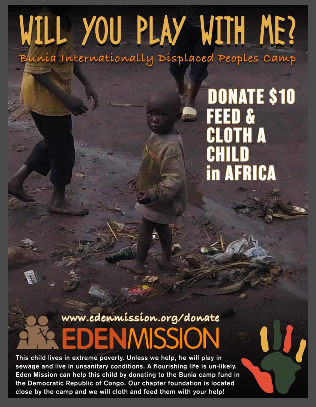
WILL YOU PLAY WITH ME was an AD that was risky to design, but I wanted to reach the hearts of the viewer so they could see the child I saw in a refugee camp just outside of Commando, Congo Africa. Some of the learning outcomes in our Effective Copywriting course allowed me the opportunity to use some images I took when visiting Africa. I thought it was a great opportunity to become creative and try to create a need for my client in Africa. Some takeaways I learned were:
-
Explain the importance of copywriting to the media designer
-
Summarize strategies for writing copy that establishes a brand voice
-
Identify and describe the key concepts in effective copywriting
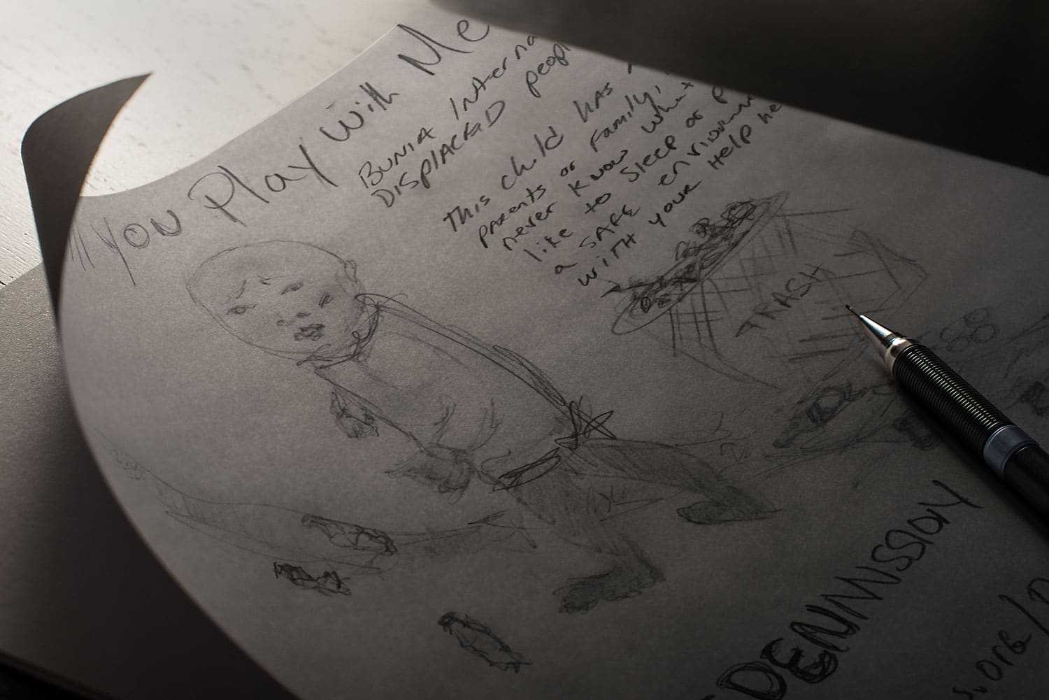
A key learning experience in designing ads that are meaningful and engage the viewers was found in George Felton’s book Advertising: Concept and Copy. (FELTON) “An orator establishes in the course of his oration an ethos—a personal character which itself functions as a means of persuasion; for if the personal image he projects is that of a man of rectitude, intel- ligence, and goodwill, the audience is instinctively in-clined to give credence to him and to his arguments.”
I don’t remember the boys name playing in the sewage as the native tongue was Zwaheli however, he was the ethos behind the project. He was a character used as a means of persuasion. Of all the photography I shot, the image of the boy using trash bottles as boats and playing in the sewage draining from the over packed tent was most memorable. I broke after the shot.
AFRICOW COMP 1
DESCRIPTION
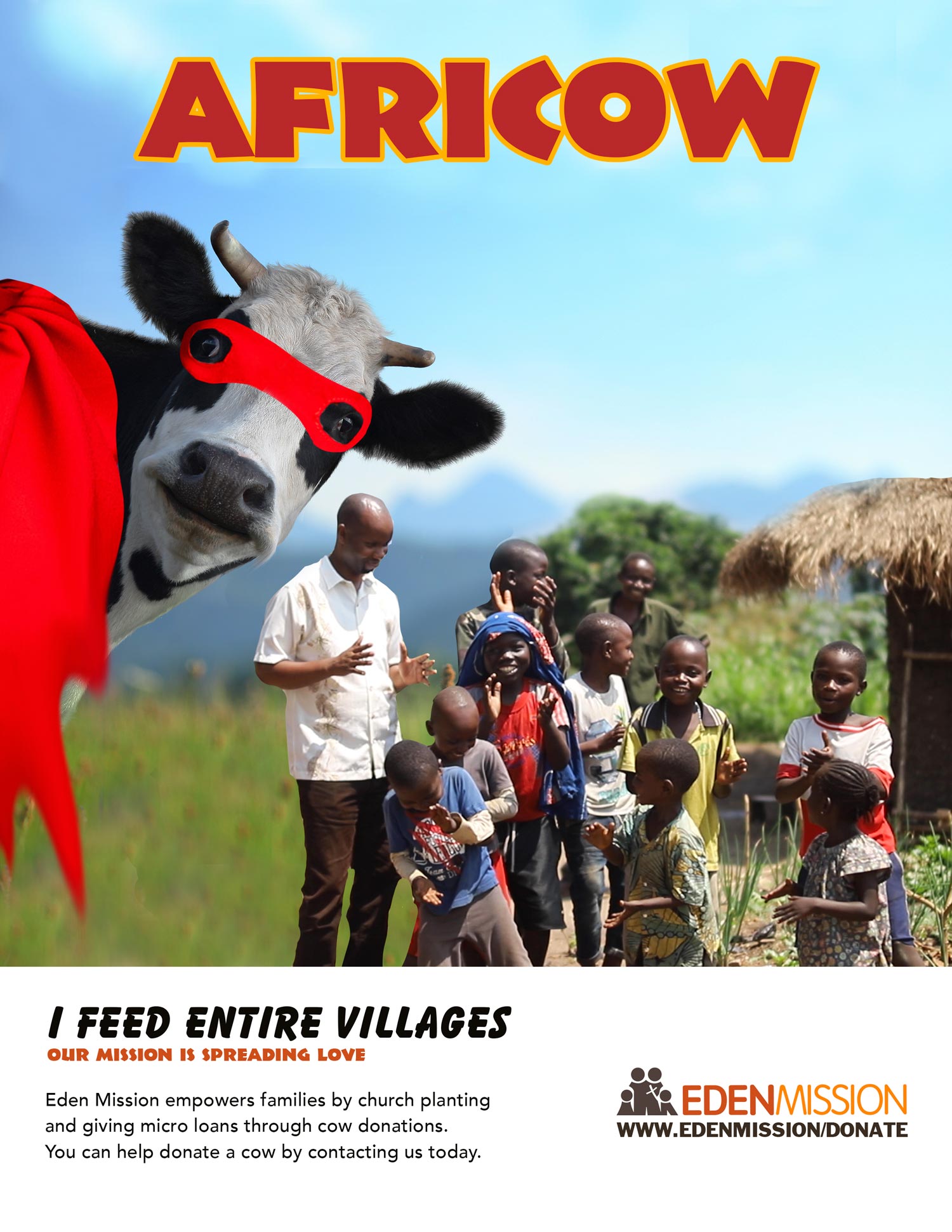
Africow was invented for Eden Mission in hopes of creating a microloan cow incentive program that would make Mr. Cow or Mrs. Cow the hero of the village. Help by donating a cow to a village and the cow becomes the local hero!
The reference to (Felton) on testimonial ads caught my attention in that he points out “a spokesperson is a great representation for a nonprofit.” The person should also be in a leadership role with great character so that he or she can testify or represent the product or service. I have chosen Kenneth Rwego from Eden Mission who is an expert in his field. Kenneth is also the President of his nonprofit and has built trust in his communities and across Africa.
AFRICOW COMP 2
DESCRIPTION
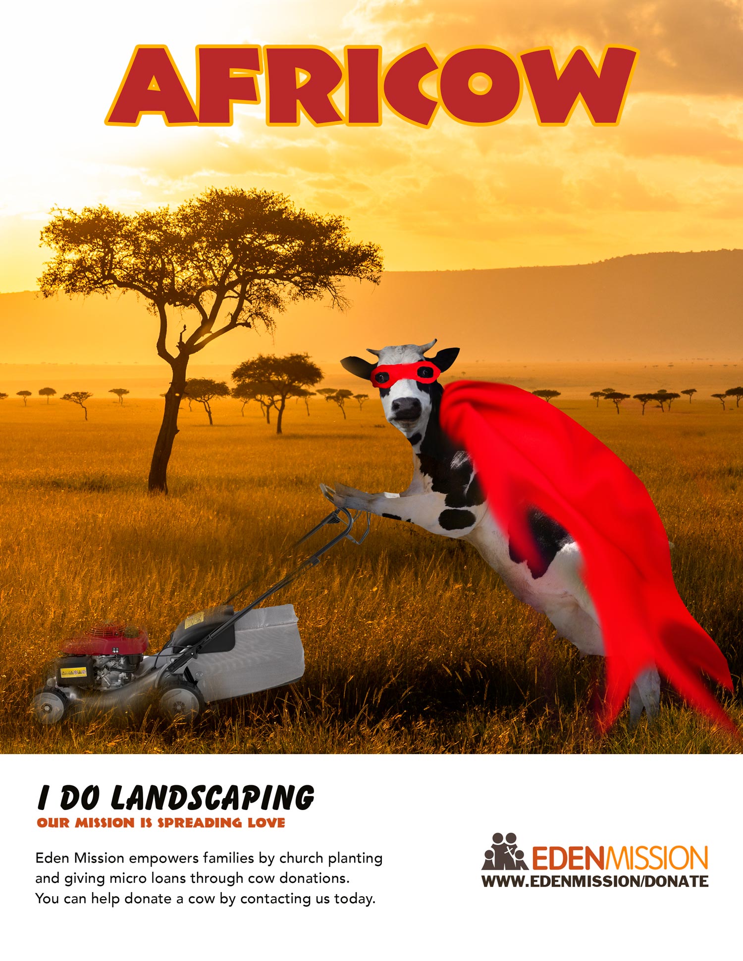
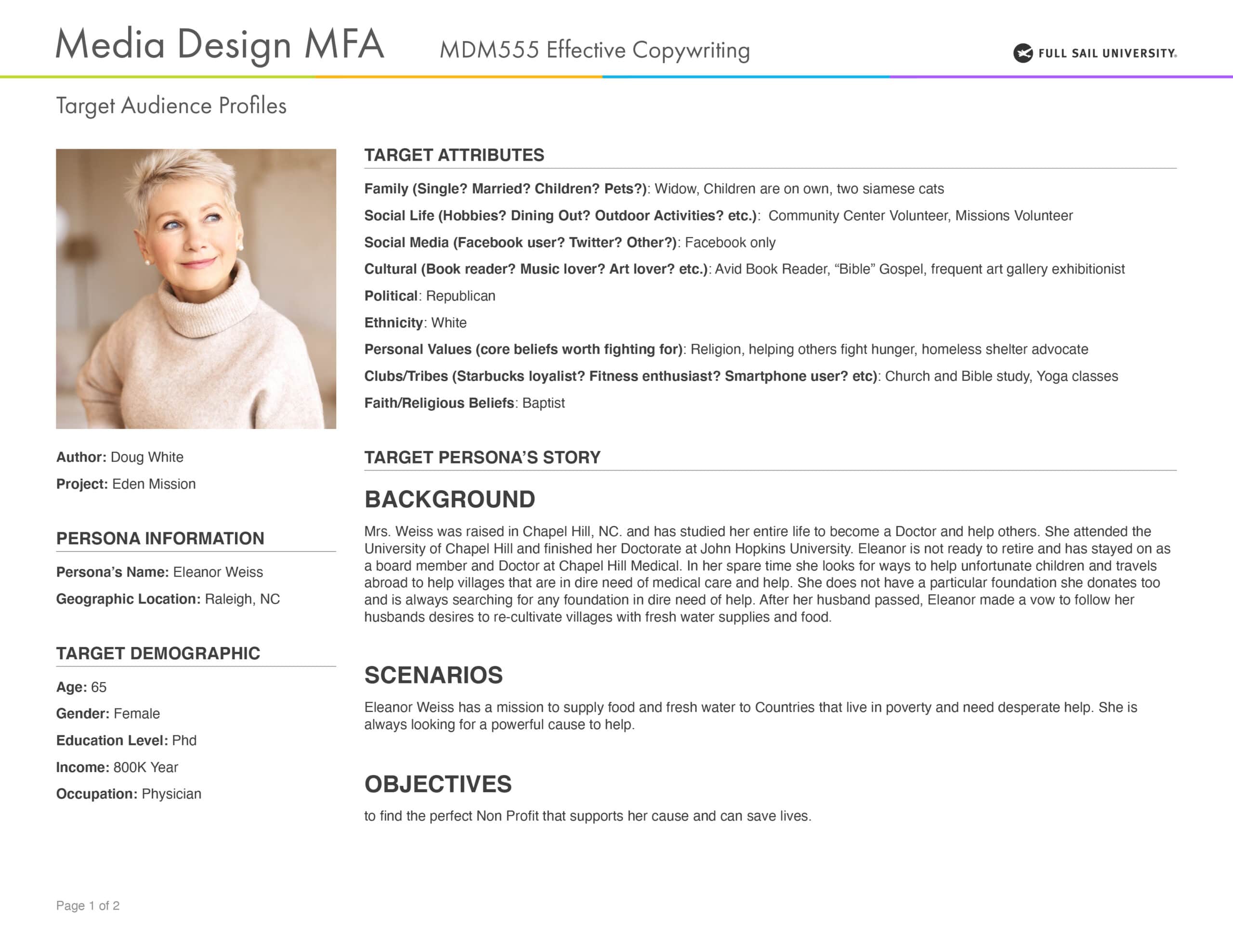
The project may not hold the power of a Chick Fillet ad, but it was fun none the less. I wanted to take our average cow and turn it into a superhero, a celebrity according to (Felton)
“Celebrities. There are a million of them. The key is to give your treatment of that famous person some.”
I’m going to write that our Celebrity spokesperson definitely has “snap” in the form of a cow with a cape on. I went even further after watching Craig Smallish’ video on experimenting with ideas. I added a resume list of why AFRICOW was a superhero. I then capped off the concept with a Lion that can’t touch AFRICOW.
AFRICOW COMP 3
DESCRIPTION
The two types of headlines I learned are straight forward command headlines and in-direct headlines. In direct headlines are something I would like to grasp as I have never been that great at them. The “I AM NOT a PET” is a great example of an intriguing headline that can draw the viewer in to actually ready the copy.
Three areas of importance for add creating according to (FELTON)
- Succorance, definitely portrays a need to receive help from others as it is apparent his family cannot do it for whatever reason.
- Understanding, we need to teach others that not every child gets a full meal each day of the week.
- Security, we are creating security for this individual by helping to donate.
PERSONA 1
DESCRIPTION
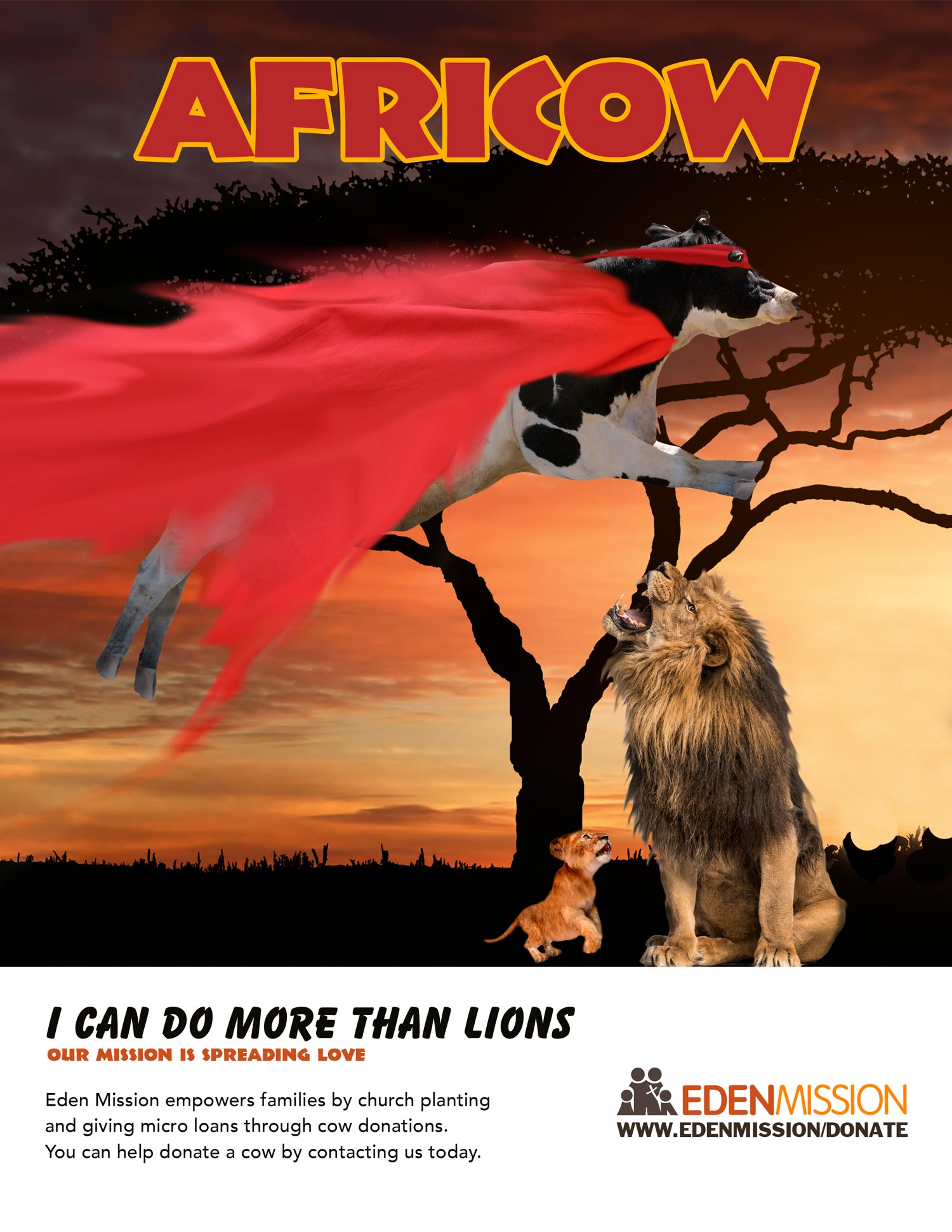
When asked to create two personas that would represent my non-profit cause I chose people I was familiar with that already donated to Missions trips and over seas ventures. Creating the perfect target audience wasn’t as difficult as let’s say trying to find users for a new social media app design. The lesson was very helpful by guiding me to quickly layout the Personas template.
Creating a Target Audience Persona was a fabricated archetype project within the Effective Writing course. The personas were geared towards finding the perfect donations sponsors that could help the missions projects I was working on.
PERSONA 2
DESCRIPTION
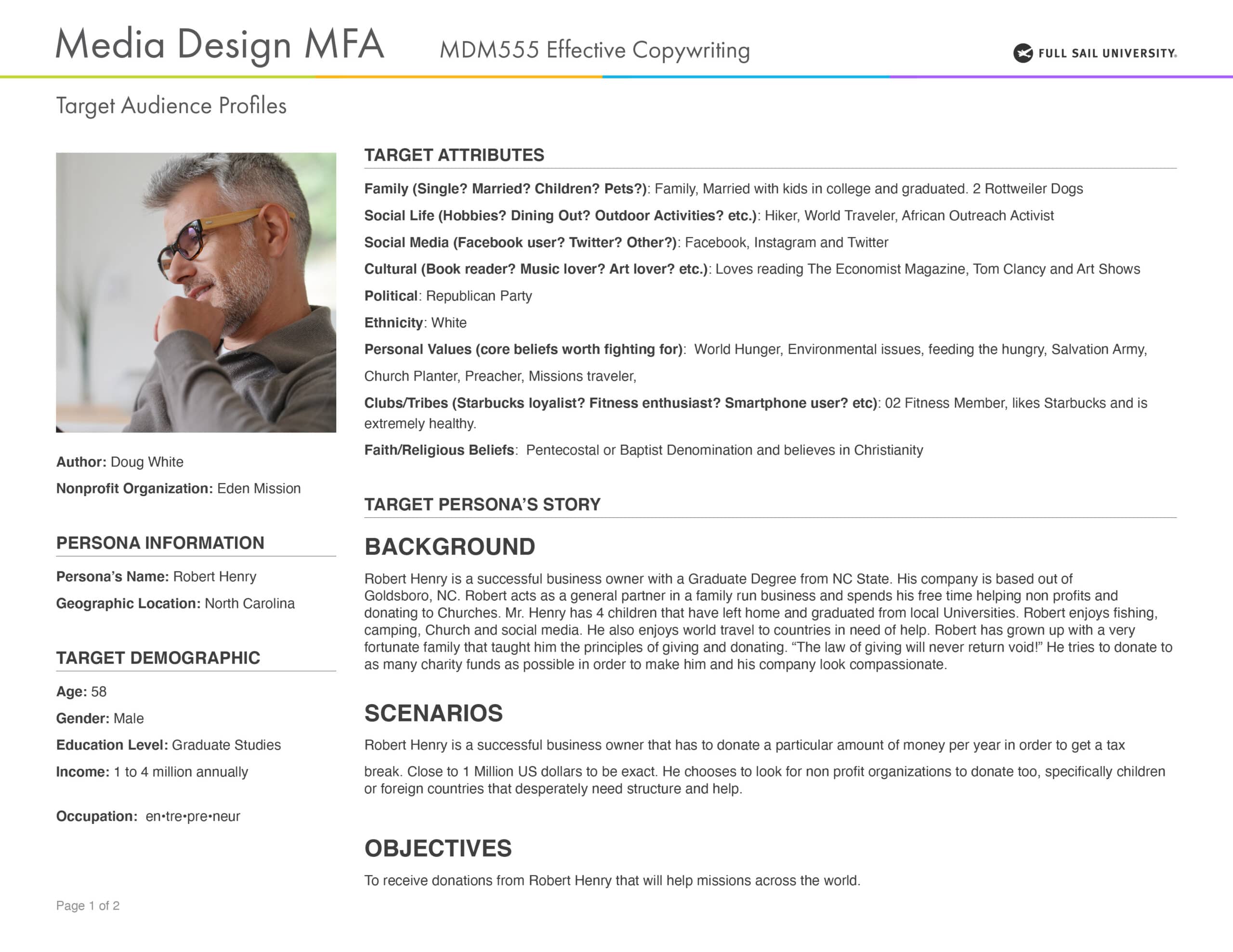
(O’GRADY) “Although personas are fictitious, they represent the needs of real users and are developed through traditional research processes. This formative research is critical to being able to validate the characteristics of the model and ensure that they are not instead based on the designer’s opinion (also known as self-referential design).
Targeting a specific demographic or person can help a project tremendously, addressing the goals of the user needs is the first step in targeting the right doner group.
AN AFRICAN DOCUMENTARY
DESCRIPTION
The Tagline lesson was a lot more difficult than expected. Writing taglines is one thing but coming up with references to why we write them took me off guard. What helped to dissect Eden Missions purpose was to write down all the benefits that customers “people in need” would get. “Elevating the project as (Felton) writes” The biggest cheerleader statement stood out to me most.”
The power of three scenarios was a great way to emphasize one of my taglines that reads, “One Love, One Family, One God.” I was able to break down the 3 main core points of Eden Mission with the rule of 3rds. Using a Metaphor was also equally effective and one of my favorite tag lines that went, “In the beginning… God Made Families.”
The main reason Eden Mission’s name starts with Eden was to get back to God’s original purpose that was for Adam and Eve to be together as one, unclothed and without sin. I’m not saying villagers need to be unclothed but definitely living by God’s will.
Creating a memorable tag line was then simple to come up with. FAMILIES EMPOWERED BY GOD. (Felton) expounds on using less words and not long paragraphs. “Less is more”. I used four words in the tagline and Eden Missions main purpose is to get families on their feet again by offering God’s help. Although Eden Missions name is a metaphor of its true meaning, there is a hidden message behind the organization that is meant for families. The phrase can definitely stand on it’s own without the Eden Mission name in front. The tagline would still remain symbolic of the tone of the non-profit. In the end I used “EDEN MISSION NEEDS URGENT HELP” as Covid 19 set in. More appropriate for the times.
The video below is a one minute teaser presentation of the footage I shot in Uganda and The Congo. Drawing awareness to the region and Eden Mission is only a start that will never end. Poverty levels in Africa are high and the resources are low. It is projects and adventures like these that keep me humbled and grateful for the opportunities I have had through Full Sail University, that being able to give feedback through my media education.
SOFTWARE AND TECHNICAL USE
The following project was designed in Adobe Illustrator, Adobe Photoshop and Adobe After Effects and edited in Adobe Premiere Pro
“Slogans are portable pieces of persuasion, little chunks of language people carry around in their heads (Nike’s “Just do it,” Apple’s “Think different”). They’re durable—often meant to last for years”
– George Felton –
MARRAKESH BRANDING
DESCRIPTION
“FIRST, A brand is not a logo.”
– Marty Neumeier –
ABOUT CASE
Exploring Marrakesh wasn’t just a quest to find desert animals and Moroccan architecture, I had to (FELTON) 1. If possible, use it: wear it, eat it, drive it, drink it, bathe with it. Try its competitors, too. Nothing replaces first-hand experience. I had to immerse myself in the project as if I were there. Searching the surrounding cities and competition to a new City Brand was exciting yet challenging. I had never gone there! However, watching movies like Raiders of the Lost Ark over 100 times was enough to make me obsessed with the region. So I became an explorer through the internet and searching for the perfect image that would portray the new Marrakesh brand.
After all of the research was done I have to agree with Marty Neumeier, developing a logo is so much more than just sketching ideas, the logo holds a universe of ideas and actions only the people of Marrakesh would relate too. If branding is a complex phenomenon then Marty Neumeier’s statement in his book, The Brand Gap, is by all means factual. “FIRST, A brand is not a logo.”
( Neumeier p.1) The statement “A brand is not a logo” is arguably one of the biggest topics in the Ad Agency world today.
SOFTWARE AND TECHNICAL USE
Adobe In Design, Adobe Illustrator, Adobe Photoshop, Adobe Kuler
FINAL MARRAKESH LOGO'S
DESCRIPTION
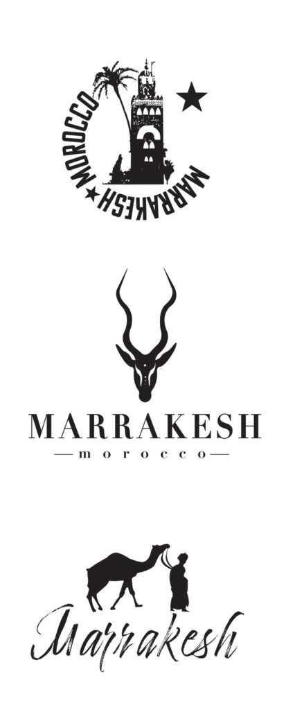
My initial three distinct concepts were based off the city of Marrakesh, which is the fourth largest city in the Kingdom of Morocco. I researched the identity and understand the core values of the idea/concept of the branded logo design. I mocked up the sketches and created vector comps in a single color, “Black” No color.. Covering the needs of client needs, city demographics, features and attributes as well as the competing surrounding markets, I believe the 3 logo marks are best suited for the meaning behind the logo concepts. Mostly, I am going to create a separate profile for each of the brand logos so that each has:
• A sense of the place – Geography
• A sense of the people – Modern Culture
• A sense of the history – Traditions
The most basic essential attributes that are wrapped into the logos are:
• Values
• Characteristics
• Differentiation
• Experience
• Purpose
The logo icon marks and typography will bring notoriety and brand recognition to the city so that tourism can grow in Marrakesh, Morocco.
Logo Design: Illustrating Logo Marks on LinkedIn Learning By: Von Glitschka was a powerful lesson that I took away from the course.
SOFTWARE AND TECHNICAL USE
Adobe Illustrator
MARRAKESH VISION BOARDS
DESCRIPTION
Creating mood boards and style sheets for three different brand approaches narrowed down the final brand submission for client review. The best method for showing comps to clients is to give them several versions to look at. Three is a safe number as it creates enough variation for client review. One is not enough and four is to many. I cannot substantiate this claim but I speak from experience coming from the agency world. Give them too much and they will get confused. Give them too little and they think your getting over on them. E-Learning Hero’s states, “Option 1: Show 2-3 slightly different designs and ask the client to choose.” On the other hand, (Designshack) claims: “There’s a balance of creating enough for a client to choose from, and avoiding work that you know will certainly just get thrown aside. If you know the client well, chances are you can present just one design option. (Seriously!)”
In the end, I designed 3 uniquely different layouts with variations in color and typography. The modern logo style is welcoming, friendly, and charming. The bright colors are fun and light-spirited to give a warm and welcome feeling. While the architecture textures show a hint of Marrakesh culture mixed with modern art.
Marrakesh Geography is a bit complex. It involves the exotic deserts, the well-known Atlas mountains and of course the city itself. The mountain wasn’t included in here otherwise it would get too busy. However, the feel of these mood boards should depict the adventurous, exotic, and enchanted side to Marrakesh.
The girl and camel picture portrays an an adventurous attitude. The deep colors and playful light show off Marrakesh’s exotic and enchanted character.
The traditions mood board is to convey the heritage of Marrakesh and its rich culture. Thus, the towering Mosque which is illuminated shows the city’s deep roots into Islamic/Arabian culture and traditions. The vibrant spices show also the traditions of Marrakesh.
SOFTWARE AND TECHNICAL USE
Adobe In Design, Adobe Illustrator, Adobe Photoshop, Adobe Kuler
DESCRIPTION
-
S = Strengths (internal)
-
W = Weaknesses (internal)
-
O = Opportunities (external)
-
T = Threats (external)
SWOT ANALYSIS
Learning how to plan a SWOT analysis or SWOT matrix helped me to understand how to identify the strengths and weaknesses, opportunities and threats to my brand. The diagrams are useful for future steps in production that can protect the new brand from future brands or existing brands with similar or likeness in creation. Bypassing this step can in effect ruin a great opportunity to skip over data necessary that is done for corporations in crisis moments, especially a re-brand project!
SOFTWARE AND TECHNICAL USE
Adobe Illustrator, Adobe Photoshop, Adobe In Design
KINETICTYPE MOTION GRAPHICS
DESCRIPTION
Learning objectives were to create an animic, cinemagraph, kinetic typography and a parallax animated sequence. The DLO taught me new principles in animation such as:
- Animating a logo
Designing titles
Animating a lower third
Creating transitions
Animating complex transitions
Creating animated call-to-actions
Outputting video for social media
ANIMATION INSTRUCTION
DESCRIPTION
My Direct Learning Outcome was advancements in Adobe After Effects and new learned principles taught by Andy Needham on LinkedIn learning. Needham provided in depth learning about the most successful social media channels and campaigns that are video-based and combine clear communication with solid motion design. The lesson on RED30 and logo animation design for social media are extremely beneficial for designers as they take you on a journey by teaching you how to perform basic 2D and 3D keyframe functions. Needham then teaches designers how to use the graph editor properly, a key element in making smooth transitions and easy ease motions.
ANIMATED DESIGN CHALLENGES
DESCRIPTION
Within these new and innovative lesson’s in Adobe After Effects it’s hard not to reflect on a statement made by Skolos and Wendell (2020) in their book, “Graphic Design Process” where in stating “Over the years, graphic design has moved through many visual and technical trends. Some tendencies remain part of the design landscape, but many fade away.” From some of the first cave paintings in Lascaux, France to modern Pixar animated films we see art in all forms taking on a myriad of animated styles.
Motion design can be seen in just about every add campaign steaming from motion pictures, social media campaigns, television commercials to famous youtubers who love combining info graphics to go with their reviews. Since there is a wide array of motion design let’s stick to a household favorite that is making strides in the motion design business. Aidin Robbins gives a tutorial on creating animations like the legendary Peter McKinnon.
The lesson is quick and to the point! There are millions of techniques in Adobe After Effects, choosing unique techniques and animated info graphics is the difficult part. Most designers spin off other designers and try to look similar. It is very crucial that a designer makes his own style unique yet following a few of the tools and techniques to arrive at a unique and different design. Robbins (2018) tutorial
PROCESS BUILDING
DESCRIPTION
Research began with exploring Adobe After Effects as a design tool that can be used to create storytelling by delivering another level of animated 3D and motiontype. “Scirocco invites the statement, “ If that message is able to modify or provoke a response then that is a good thing”. The amazing news about creating animations in Adobe After Effects is the never-ending learning curve that is never ending. The American Graphics Institute states Smith (2020) “ The primary uses of After Effects can be divided into three categories: Animation, Effects, and compositing”. Think on the days of the first gif animations with Adobe Photoshop. Next came flash design that carried a non-linear sprit expressions framework that delivered web animations. Today, these applications are second to the mass affects gallery inside Adobe After Effects. So much so that flash is obsolete and Adobe Photoshop is merely a base to image manipulation only to be brought into Adobe After Effects for pre coming and compositing animations.
AFTER EFFECTS
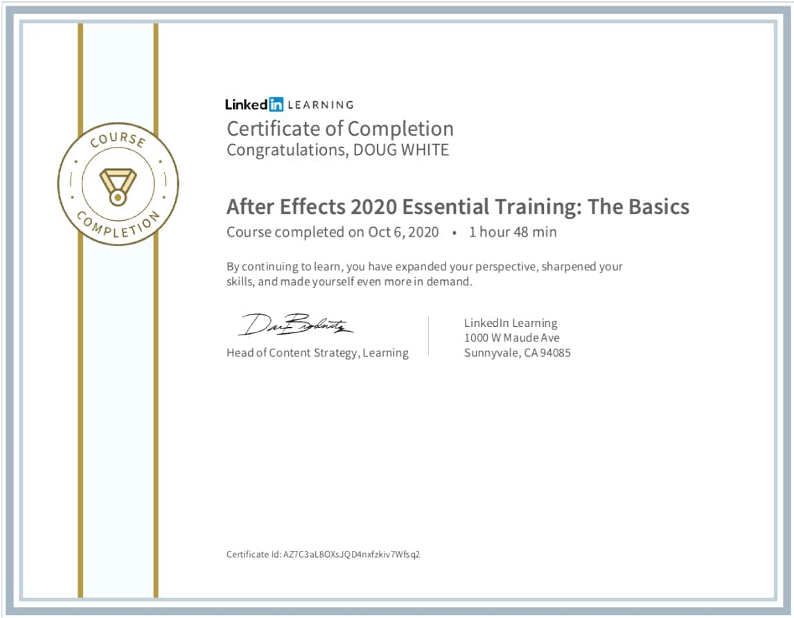
In taking the online Course for the basic Adobe After Effects certification it is important to understand that a refresher course can always help you to catch a function within aftereffects that may have been overlooked. Diving deeper there was a useful course presented by “Winters (2016) on the subject of expressions. During the 2.3 Design Challenge the use of expressions and coding rotational elements within the design project was another level that is highly recommended for designers of motion that want to take key frames and animation to another level.
MOTION GRAPHICS
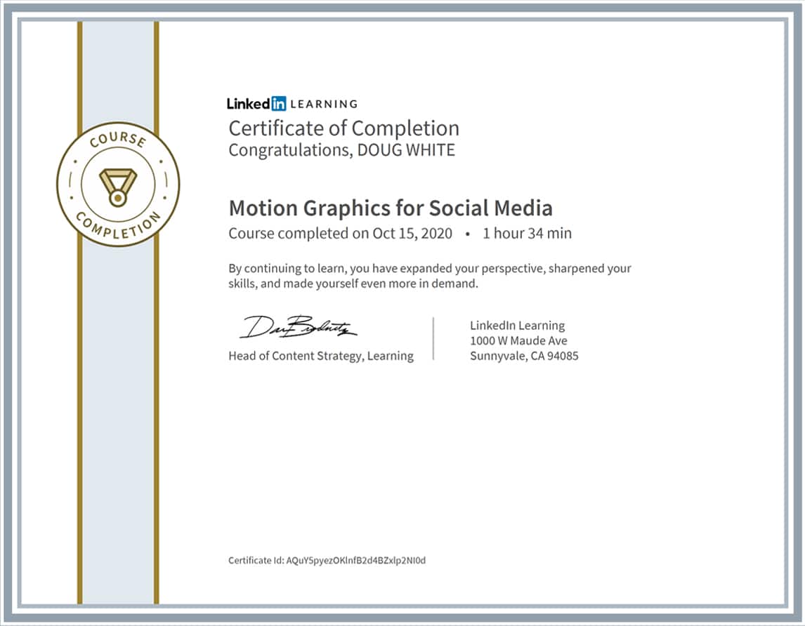
The social media certification in motion graphics training was taught by Andy Needham, Motion Designer, Editor, Compositor. The project focused on the RED 30 Animation. The takeaway was a valuable lesson in Easy Ease and Key framing smoothness for me. My After Effects Elements flow smoother now and I am grateful for Andy’s techniques. The course definitely improve my social media impact by helping me to create eye-catching content.
REFERENCES:
(O’Grady, 20090201, p. 86) A Designer’s Research Manual.
[VitalSource Bookshelf 10.0.1]. Retrieved from vbk://9781616739386
Anderson (2021) How many mockups or design comps do you show clients?
https://community.articulate.com/discussions/building-better-courses/how-many-mockups-or-design-comps-do-you-show-clients
NEUMEIER, M. (2003) The Brand Gap
https://documentcloud.adobe.com/link/review?uri=urn:aaid:scds:US:777bdcb4-93aa-4269-a23a-916fa4c7b897
Chase, M. (2013) Chasing the Bright Light
https://www.chasedesigngroup.com/wp-content/uploads/2018/03/CTBL_Master_PressPack.pdf
Felton, G. (2013). Advertising: Concept and Copy (Third Edition), 3rd Edition.p. 93)
[VitalSource Bookshelf 10.0.1]. Retrieved from vbk://9780393733921
Felton, G. (2013). Advertising: Concept and Copy (Third Edition), 3rd Edition. p. 241)
[VitalSource Bookshelf 10.0.1]. Retrieved from vbk://9780393733921
Felton, G. (2013). Advertising: Concept and Copy (Third Edition), 3rd Edition. p. 27)
[VitalSource Bookshelf 10.0.1]. Retrieved from vbk://9780393733921
O’Grady, J. V., O’Grady, K. (20090201). A Designer’s Research Manual. p. 56)
[VitalSource Bookshelf 10.0.1]. Retrieved from vbk://9781616739386
Felton, G. (20130805). Advertising: Concept and Copy (Third Edition), 3rd Edition.p. 13)
[VitalSource Bookshelf 10.0.1]. Retrieved from vbk://9780393733921
NEUMEIER, M. (2003) The Brand Gap – A brand is not a Logo
https://documentcloud.adobe.com/link/review?uri=urn:aaid:scds:US:777bdcb4-93aa-4269-a23a-916fa4c7b897
Glitschka, V. (2016) Logo Design: Illustrating Logo Marks – LinkedIn Learning
https://www.linkedin.com/learning/logo-design-illustrating-logo-marks/the-clockwork-method?u=50813145
Design Shack (2021) How Many Design Options Should You Show a Client?
https://designshack.net/articles/business-articles/how-many-design-options-should-you-show-a-client/
Needham, A. (2019) Motion Graphics for Social Media
https://www.linkedin.com/learning/motion-graphics-for-social-media/motion-graphics-for-social-media?u=50813145
Robbins (2018) Peter McKinnon Animations Tutorial
https://www.youtube.com/watch?v=jUTqGIzg6Vk