The Box Park Sushi Brand initiative was composed of four months of analytical research and data scrubbing prior to designing any brand or concept work. In month eight’s class “Design Strategies & Motivation” The tasks were to connect the brand imagery that would be created in month nine and ten. Research methodologies were also done to find the voice and tone of the project that helped to find the customer base.

(Quindlen) The only thing that makes writing good is give- in it our voice, our own personality. Writing is always an act of faith in your own character.

Demographics and psychographics were yet another process in defining who the perfect sushi goer would be. Once the initial qualitative and quantitative research was done on our consumer prototypes, we could better understand the buying behavior behind our new clientele. The creative brief was then formulated and designed based off the research that was done.

Design integration in month eight was building the voice and tone of the project. There were many exercises and brainstorming sessions that would eventually narrow down the idea and concepts for the upcoming mood and vision board. The design brief helped to finalize the logo design and new branding attributes that would eventually be used in all our delivery projects.

Multi-Platform Delivery in month ten used a design model that was written to determine design effectiveness. The core lesson was to identify between hard and soft design values. Next, a Q&A survey was constructed and given to ten associates for determining the brand efficacy behind the design thinking. Expert connections were made between the instructional materials and the solution. The project was developed, synthesized, and advanced into entirely new forms, elevating the entire project considerably. The final delivery was beautifully designed imagery, cinema 4d renderings of the Sushi establishment, and the new logo brand that are in the final design brief, brand guide and animated info graphic video detailing the design effectiveness of the entire project.

“Sushi – con·nois·seur
an expert judge in matters of taste.”

BOX PARK SUSHI BRAND DESIGN

DESCRIPTION

The Box Park Sushi brand project spanned over 4 months covering not only research and development but core business design strategies that brought the project to life! Building the Voice and Tone of the Box Park Sushi BRAND would be the foundation of its design and elements. There were many exercises and brainstorming sessions that would eventually narrow down the idea and concept for the Mood and Vision Board that set the premise for the clients request. There were other variables as well that included a tagline, mission statement, introductory paragraph, and onliness statement.

The rationale and group questioning of the ideas and building process were very helpful to minimize and streamline a few direct and distinct words that would become the backbone of the Design Brief! Resources that were useful in determining and finding the voice were used from (FELTON) – Advertising Concept and Copy that helped define the voice.

DEVELOPMENT PROCESS

The following images are final designed elements by Doug White that are part of the outcome that took flight over four classes in the Master of Media Design course at Full Sail University. The classes that defined the project were built from teachings by Professor Bartley Argo – Design Strategies and Motivation, Professor Adam Baldowski – Design Integration, Professor Andrea Kratz – Multi-Platform Delivery and Doctor Colleen Cleveland – Measuring Design Effectiveness and Professor Tyan McClung for guiding me in and helping me to substantiate my findings. What was design, how it was designed and the synthesized research can be seen below.


(FELTON)  “no matter what that message is, or where it appears, it should represent the brand’s personality and speak with the right voice.”

SOFTWARE AND TECHNICAL USE

Box Park Sushi was constructed using traditional sketching, Adobe Photoshop, Adobe Illustrator, Adobe In Design, Adobe After Effects, Adobe Premiere and Cinema 4D with the use of VRAY for realistic lighting.

THE WORK

January 2020 – August 2021

Professor Baldowski:  WHAT IS A BRAND VOICE?

The personality and emotion infused into a company’s communication.

It isn’t just the beliefs of the brand,

but it is also in what is said and where it is said.”

UNDERSTANDING CONSUMER BEHAVIOR

DESCRIPTION

Breaking down guide words helped to establish the direction that was taken to understanding consumer behavior for the Box Park Sushi brand project. Words like Mystical, Exploratory and Euphoric came to mind when conceptualizing the idea of creating a sushi restaurant. Breaking down the region and demographics of the Milwaukee area was an important step to dissect the clientele that would be eating at the establishment.

By researching the competition and writing weekly live session posts on findings, The Box Park Sushi Brand design soon evolved and would be one of its kind. The TAG line below is the mission statement for the project.

ABOUT CASE

The Design and layout was done using Adobe In Design, Adobe Illustrator and Adobe Photoshop.

Mission Statement – Delivering an aesthetically clean and fresh Sushi experience while holding onto atmosphere and coolness.

SOFTWARE AND TECHNICAL USE

Adobe In Design, Adobe Illustrator and Adobe Photoshop

ONLINESS STATEMENT  ?

Box Park Sushi is the only Sushi Restaurant Bar

in a makeshift shipping container!”

THE CREATIVE BRIEF

DESCRIPTION

Felton’s Advertising: Concept and Copy is an innovative approach to advertising creativity. It covers the entire conceptual process, including a creative brief that is ideally used for creatives to get out the necessary components and questions so that designers can use it as a guide. (FELTON) “This first section shows how to research products, understand consumer behavior, analyze audiences, and navigate marketplace realities, then how to write creative briefs that focus this strategic analysis into specific advertising objectives.”

ABOUT CASE

(Felton) “There is no one way to write a brief, except thoughtfully.” Although this statement stands true to creativity it is not meant to stand alone. In this assignment (Maslow) The Hierarchy of Needs and the Shopping List of Needs was used in order to both deal with meeting the needs of the consumer and implementing consumer based questions that allowed for the project to come alive by pointing out key characteristics the consumer wanted from the new brand and not the designer. It was important to identify the key personality traits of what potential sushi clients would want in the new brand.


SOFTWARE AND TECHNICAL USE
Adobe Illustrator


Speak The audience’s Language
To know whom to write for is to know how to write.”

— Virginia Woolf –

BOX PARK SUSHI MOOD BOARDS

DESCRIPTION

Building the mood board, “Vision Board”  project served as a fundamental transition between the initial concept, thought and first draft. Establishing a strong foundation for Box Park Sushi client review was the core premises for the project and a key factor for guiding the vision of the clients wishes. Building the mood board was simple enough to pull research from websites such as pinterest.

When the initial concepting was thought out on Box Park Sushi there are textures that must be taken into account to obscure the engineering of a shipping container.

ABOUT CASE

In order to fill in the grooves and gaps of a container and hide the imperfections in the metal, a “Marmorino” plaster finish can be applied. Prior to the preparation of applying the marmarino plaster, which is a form of a venetian plaster, a smooth level finish must be applied. Using a foam insulation wall spray will help to fill in the gaps and harden in order to apply the Marmorino. Marmorino looks modern when wet and can be complimented with a sanded smooth finish that almost takes on a wax look.

From there, Bamboo, water features, lighting and integrated wood trim can make a cheap container look like an art gallery peace suitable for a 5-star restaurant. Organic design must prevail over a concrete jungle location and the textures are prevalent with natural organic materials. If asked what organic design is, (DAEVAS)

“Organic Architecture is a term Frank Lloyd Wright used to describe his approach to architectural design. Louis Sullivan, Frank Lloyd Wright’s mentor, held that “form follows function. This idea formed the impetus for Wright’s philosophy, and his assertion that “form and function are one”.

SOFTWARE AND TECHNICAL USE

Adobe Photoshop

THE DESIGN BRIEF

DESCRIPTION

The Design Brief was developed to emphasize the voice and tone based off the static mood board design. The previous creative brief and strategy development brief were very different in color, design and layout. The Design Brief is clean and concise covering the basic points of the voice and tone. The overall design of the design brief entails a background that is white with the exception of the artwork and a few pull quote areas with grungy background textures. This is key for printing and distributing amongst co workers to review.

There are many harmonious color pallets’ that could have been chosen for the Box Park Sushi concepts. In particular, a mood of organic color combinations was chosen to compliment that of the Japanese Culture. The RED in the Japanese circle flag, the black with all of the characteristics of the calligraphy logo. The greens that complement the mood of the bamboo that is to shade certain parts of the shipping container. The grey color that will be used to compliment the texture of the marmarino finishes. The browns that are symbolic of the wood trays and tables. Each element of color was purposely chosen from a color palette that was dropped from adobe color. Using color logic, Primary, Secondary and Tertiary colors were used from each chart. Red and Black being the primary colors, Gray and Charcoal as secondary usage while green and brown use the Tertiary color chart as a third distinct colors. Something to keep in mind while not overusing colors and creating harshness and an abrasive tone is this statement, “In summary, extreme unity leads to under-stimulation, extreme complexity leads to over-stimulation. Harmony is a dynamic equilibrium.” (Colormatters)

ABOUT CASE

The photos are meant to create a mystic idea, a vision that holds true to a Japanese culture with a touch of “Frank Lloyd Wright” natural design tones and organic earth elements. The imagery is simple, textures and finishes that give off a mood of style and atmosphere for the trendy and deserving. Images that are makeshift containers made into stylistic living quarters or wood finishes stacked as art on a wall. Bamboo that gives off the heir of Japanese culture. Fine Sushi Chefs preparing elegant plates of the freshest fish and intricate Sushi on the menu. An origami mini tree representing the ZEN that comes with the atmosphere and environment. Iron T Pots with turquoise blended colors to set the tables against oak wood. Mostly, the vision board was created to not over convoluted or overwhelm the viewer. It was created to present a unique vision and idea that compliments all aspect of Box Park Sushi. Following the Kiss concept by Pixpa was an essential process that states:

“The KISS concept is very important in creating idea boards, so keep it simple! Too much clutter doesn’t help anyone. It confuses your audience and collaborators, and it leads to cloudiness in your mind.” (Tripathi)


SOFTWARE AND TECHNICAL USE

Adobe Photoshop, Adobe In Design, Adobe Illustrator

DYNAMIC VISION MOVIE

DESCRIPTION

Presenting a first impression vision is important. Being able to use animation with parallax effects, coloring filters, 3D text movements, 3D camera moves with transparency PNG artwork and custom logo branding elements allows for a true first impression of the designers ability to take a project by storm. (ndigitec.com) collaborates on exactly what motion graphics are. “In their essence, motion graphics are like animated graphic designs. It unites music, graphics, characters, and motion to tell a story, pursued, or move the viewer. You can see that with so many pieces at play, the possibilities are limitless. No wonder, motion graphics are such a powerful storytelling and styling tool.”

There is a certain level you ascertain in print and web development that inspires designers to take it one step further and mix animation with their art to bring their vision to life. If you simply want a bland client unlike Nike, then just deliver the basics and see how far that takes you! Designers have to know Adobe After Effects like a second language. It’s required in today’s design world to separate artists and animators that deliver stellar work and can take a business through all phases of development. Not just business cars and logo branding! Juxtapose the logo and vision into a well thought out branded commercial like T Mobile or Sprint and the next step in your life will be the Big Time. Don’t tell a story with the best possible vision and your story will die.

ABOUT CASE

The video and imagery were pulled from pexels that were sufficient enough to bring a story to life by presenting the vision with mood and tone through foreign images of natural landscapes and textures of nature that complimented the design of the Box Park Sushi vision and concept. In order to build a vision that has not been created it’s important to use effects that can help present a dream. With the use of VFX Motion EFX, Red Giant, Magic Bullet and a plethora of coloring / camera moves inside Adobe After Effects, the process of creating blended dream movements that were timeless and matched the sequential blend plus adding music beads and ocean sound effects helped the project to come alive!

SOFTWARE AND TECHNICAL USE

Adobe Photoshop, Adobe After Effects, Adobe In Design, Adobe Illustrator

CASE LAUNCH

The building of the Box Park Sushi motion | vision movie was done in Adobe After Effects using advanced plugins and motion effects. The instructional sequence will help you visual the Adobe After Effects process.

BOX PARK SUSHI LOGO BRANDING

DESCRIPTION

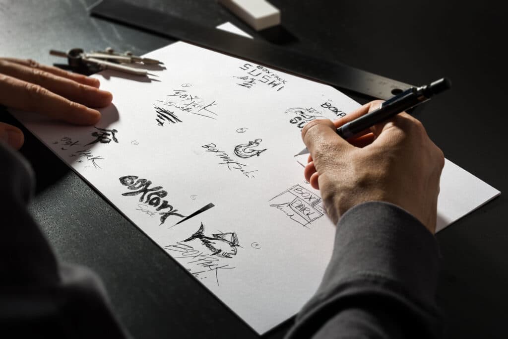
The design briefs that were created were a valuable asset this month in helping to finalize Logo design and new branding requirements for the Final Brand Guide Project. Studying sushi etiquette and the history on how sushi evolved has been an important factor in understanding how Sushi is prepared, why it is prepared and to whom it is prepared. The “All about Sushi Guide” states, Sushi etiquette is as intertwined into Japan’s history, culture and traditions as it is in the Japanese tea ceremony, cherry blossom festivals, and calligraphy. Sushi for the Japanese was not only a tradition and celebration of LIFE, but it was also a process of preparation that was not considered fast food. It is and always will be a traditional cultural experience that is not only mystic but a matter of the soul’s life and happiness. Designing a cool hip logo that represented the Japanese culture, fish, sushi, exotic would be a memorable iconic process.

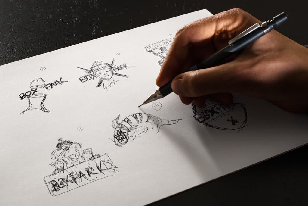
Dougs Sketches

ABOUT CASE

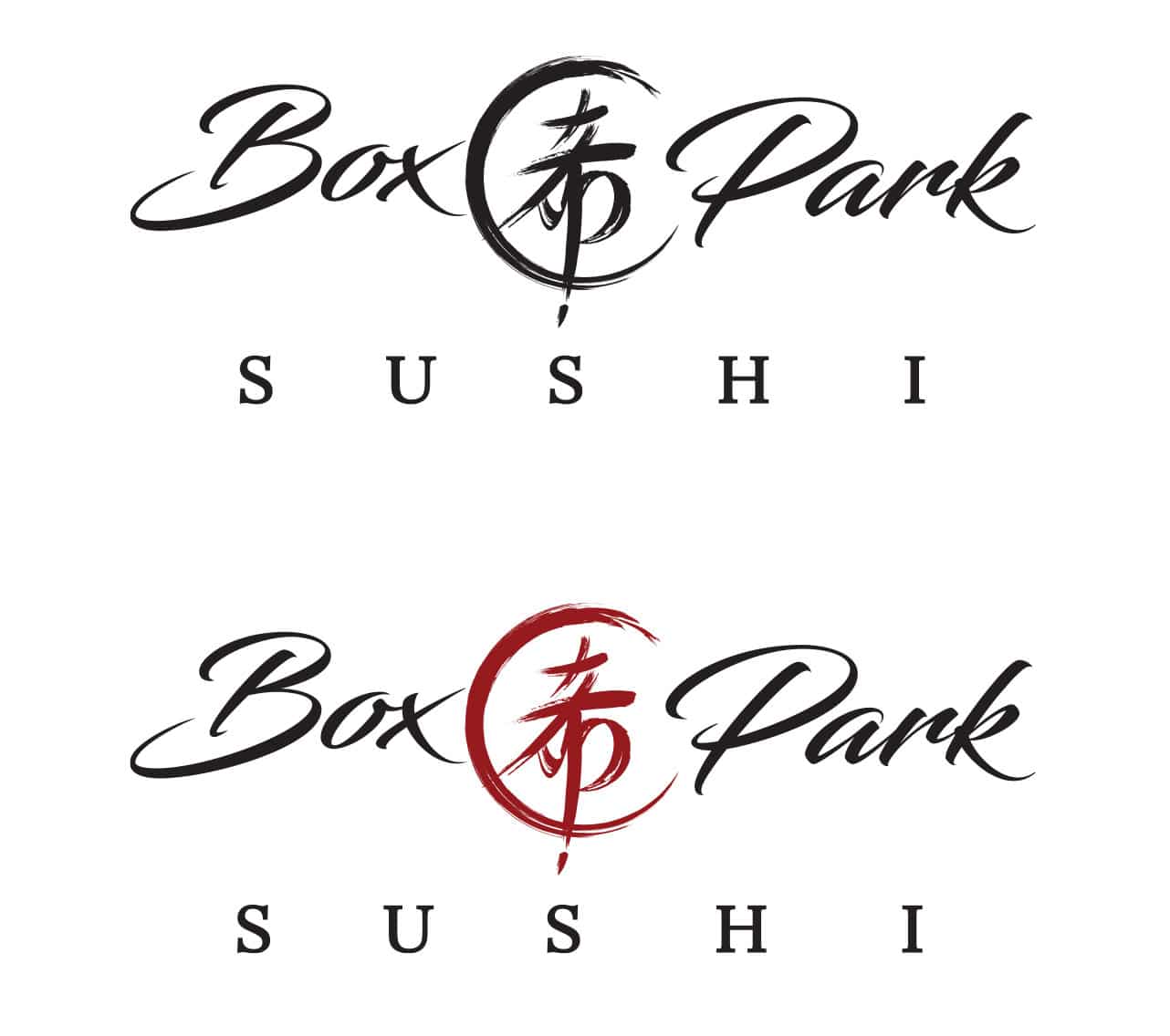
Establishing the brand presence so that the logo brand was the tip of the iceberg was a process of defining the brand attributes and the elements that made up the concepts. The proposed voice and tone had much to do with the core meaning behind Box Park Sushi. In choosing a town in Yorii Japan that was essentially a peaceful culture that nourished life and family the idea of a Kanji symbol was developed and integrate into the cursive writing. The icon means “LIFE” A Kanji symbol with a culture that embellished and screams sushi.

Narrowing down and defining the first logo concepts so that the brand image was more than just a logo was the first step towards the final logo. Feedback from Professors and students helped to define and narrow down the final three logos to be vectored in Adobe Illustrator.


SOFTWARE AND TECHNICAL USE

Hand Sketches and Adobe Illustrator

Doug White Sketches 2

LOGO COMP 1 CONCEPT


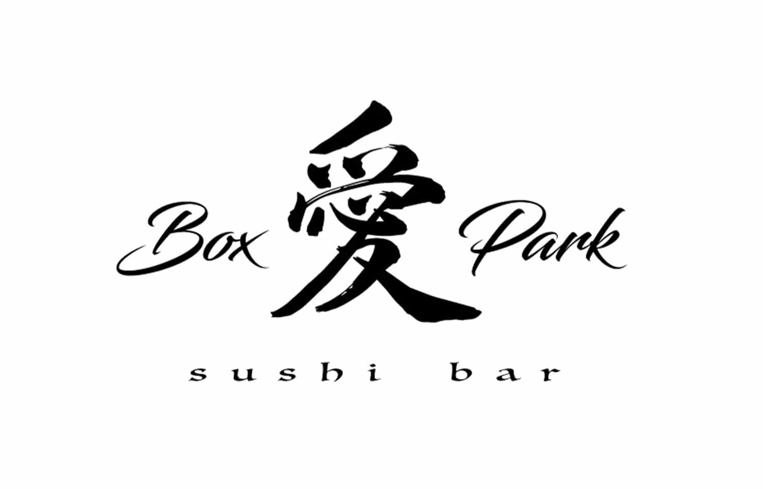
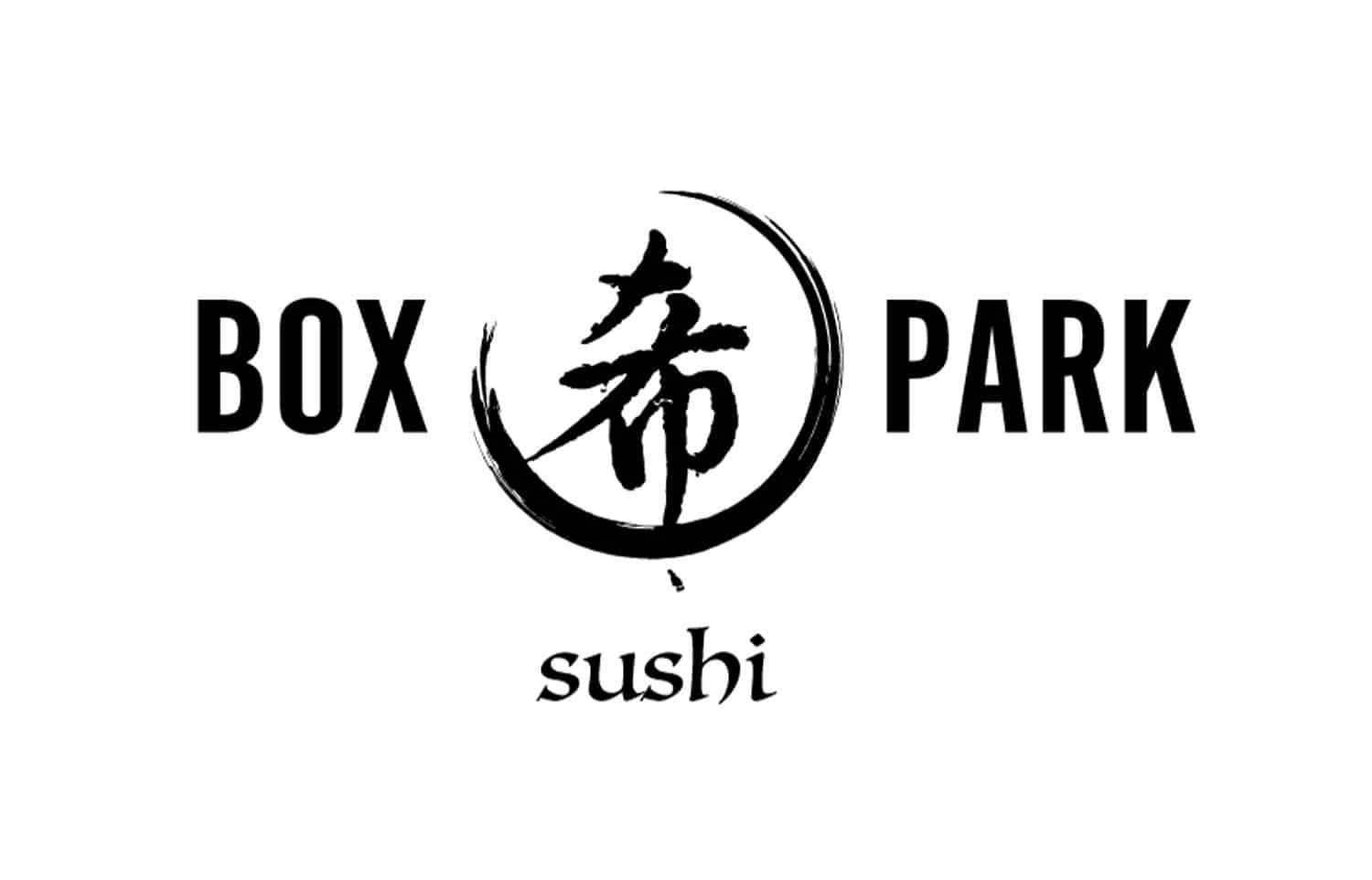
Concept sketches and vector art were geared towards designing a cultural symbol from Japan that worshiped and lived by life, food and the desire to create sensual, mystic life. By researching the Kanji symbol and the town of Yorii the logo began to take on life by representing a symbol for love and life. This first concept morphed into a further custom Kanji design with a circle representing the Japanese red sun!

Box Park Sushi Comp 3
Box Park Sushi Comp 2

LOGO COMP 2 CONCEPT


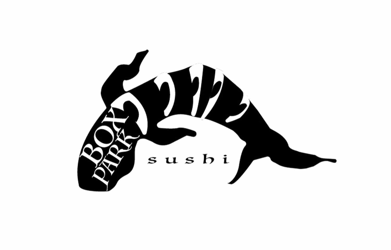
This concept of a KOI fish that is a national symbol in Japan representing love, friendship and commitment was dissected to represent a cut up sushi roll. However the concept had been used on many sushi restaurants and was dismissed. Using a fish symbol for Box Park Sushi has been done and done again. The connection of life and sushi was a unique and meaningful symbol that is different than anything previously researched about eating Sushi. When you visualize the Box Park Sushi brand there is a special twist to what lies underneath, not just a cool logo. There is also a crescent moon that embellishes and wraps the symbol portraying a cut up hot and spicy tuna roll.

LOGO COMP 3 CONCEPT


In this version the class narrowed down the concept with a custom Kanji symbol that represented life! However, a needed handwritten font case was requested other than calligraphy to bring in the final approved vector image.

Box Park Sushi Comp 1
box park sushi final logos

FINAL LOGO DESIGN

DESCRIPTION


Without food there is no life, The kanji symbol represents life at the roots. When we eat and love life we grow spiritually and beautifully. LIFE! Without food to nourish life there is no life. The is a story behind a movement and cultural past time in Japan and sushi has been woven into the fabric of the Japanese culture. It is more than just a logo design that portrays a piece of sushi. A logo needs a concept with a brand that forms a story and YELLS at people to come read what’s inside. Combining life with a traditional beautiful town is a mysterious, sensual, traditional and beautiful concept that will sit well inside a modern design.


SOFTWARE AND TECHNICAL USE

Adobe Illustrator

BOX PARK SUSHI BRAND GUIDE

DESCRIPTION

The following layout is next to the final project that has taken form since the inception of the creative brief and design brief. It was designed to follow brand standards allowing for growth and elements to be added as the restaurant grows or changes, but only by the original designer or working agency. Brand agencies or outsourced designers need to follow a strict guideline for workflow consistency that maintains and complies with brand awareness.  After working with Professor Kratz and coming up with a vision and brand that compliments the exterior and interior features, the final brand design shows a compelling story of innovation and creativity.

Overall the process of creating concept sketches to vector art that eventually morphed into 3D rendering and a final brand guide allowed the branding process to develop into a clean and simplistic design layout. The Japanese culture integration is extremely decorative, colorful yet clean and modern. The project has highlights of inspirations such as Frank Loyd Wright and Le Corbusier. BROWNING “Less is More”. Following the theory allowed the project to advance using Adobe illustrator with ease with not too many technology advancements. Simple, calligraphy brush strokes. Cinema 4D using Red and VRAY was a technological advancement in restaurant design, particularly with the innovative conceptualization of a shipping container.

FINAL SURVEY MOTION GRAPHICS

DESCRIPTION

Ken and Jenn Visocky O’Grady used specific analogies for designers to become acquainted with the tools of their trade and how important it is to research both qualitative and quantitative methods so that design projects come to life. Using such techniques as understanding our software and new marketing trends will improve data research, visual elements and the voice and tone. To connect the branded design project with real world opinions in determine areas of focus that needed attention and adjustments, a design questionnaire/survey was drafted.  https://dougwhitecreative.com/portfolio/box-park-sushi/. Survey Monkey was the recommended choice of survey applications, however the minimal functionality because of locked features in the free version allowed for a more creative approach that ended in a custom designed solution hosted on www.dougwhitecreative.com

Questions and sketch out a sample infographics displaying the results of the survey with an average mean percentage were then designed and animated. Adhering to the project scope that was supposed to unite the tone and voice of our previous brand guide, the project next came alive!  The process entailed integrating the graphics from the brand guide using Adobe After Effects to layout and animate a motion graphic project. Juxtaposing visual elements used from the brand, i.e., Kanji symbols, fonts, colors and textures, moving data and a visual representation of what Box Park Sushi is and what people thought was useful in determining if the brand campaign was successfully designed. The use of charts, pies, graphs, and very descriptive motion graphics that were color branded and clean were set in motion.


SOFTWARE AND TECHNICAL USE

Adobe Illustrator, Adobe Photoshop, Adobe After Effects, Adobe Premiere Pro

REFERENCES:

Felton,G.  (2013) Advertising: Concept and Copy (Third Edition), 3rd Edition.
VitalSource Bookshelf 10.0.1]. Retrieved from vbk://9780393733921

Felton, G. (2013). Advertising: Concept and Copy (Third Edition), 3rd Edition. p. 93)
[VitalSource Bookshelf 10.0.1]. Retrieved from vbk://9780393733921

Professor Baldowski (2021) WHAT IS A BRAND VOICE?  “The personality and emotion infused into a company’s communication.”
https://www.fullsail.edu/

Felton, G. (2013). Advertising: Concept and Copy (Third Edition), 3rd Edition. p. 22)
[VitalSource Bookshelf 10.0.1]. Retrieved from vbk://9780393733921

Felton, G. (2013). Advertising: Concept and Copy (Third Edition), 3rd Edition. p. 39)
VitalSource Bookshelf 10.0.1]. Retrieved from vbk://9780393733921

Daevas (2016) Organic Design | A Balance Between the Manmade and Natural Worlds

Organic Design | A Balance Between The Manmade And Natural Worlds

Morton, J.L. (2021) Basic Color Theory
https://www.colormatters.com/color-and-design/basic-color-theory

Tripathi, A. (2020) 15 Great Tips on How To Create Awesome Mood Boards
https://www.pixpa.com/blog/mood-boards

NDIGITEC (2019) 5 Types of Motion Graphics You Need to Know

5 Types of Motion Graphics You Need to Know

All About Sushi Guide
https://www.allaboutsushiguide.com/

Japanese Kanji Symbols (2011) “Inochi” means Life, The most important things

“Inochi” – Japanese Kanji Symbols for Life, The most important things

Browning, R. (2021) Less is More
http://www.abstractconcreteworks.com/essays/lessismore/ls_s_mor.html

CINEMA4D (2021) 3D Computer Animation Software
https://www.maxon.net/en/cinema-4d

VRAY (2021) VRAY for Cinema 4D
https://vray.us/

White, D. (2021) Box Park Sushi Survey Questionaire

Box Park Sushi